
I hope you enjoy looking at my work and look forward to hearing from you.
The above is a postcard i had to design as part of an AS project at college. Using Tom Cruise and a Mini we had to make a selection of postcards in different styles. This is my favorite of the 10, combining different techniques with some aspects done by hand and others using ICT.


At full scale this is an A2 poster I made for a festival, developing a whole new brand of festival and logo. As a festival goer myself knowing people aren't interested in just the music but the overall experience as a whole I aimed to portray a bright relaxed summer theme without making the poster too complicated and going away from the main aim of the poster, which was to show the public the artists performing.

This is a piece of work I did in my own time after seeing something similar when on holiday. I enjoy doing work that combines elements that are different to what people expect to see.

Another piece of work I did in my own time experimenting with different techniques in photoshop.


Malcolm X was a main figure I used in my A2 revolution project. I wanted do a vector after seeing some other vectors online, I thought the technique was the type of style I'm interested in, produced some good looking work and would help with picking up some techniques using Photoshop.

Also part of the revolution project using Photoshop I manipulated the 6 images all into the same style. Motown played a huge part my project so I did a piece of work on 6 of the most iconic artists.
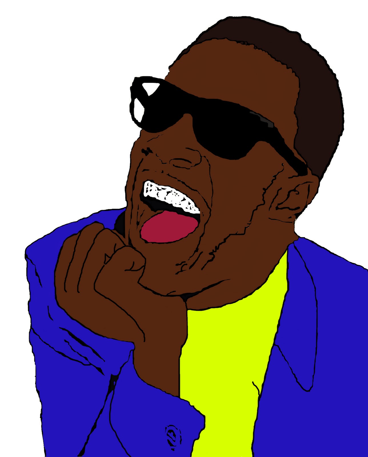
My first vector technique would only work on certain images, so I tried doing a vector in a different way which produced a completely different style. The vector here is of young Stevie Wonder, one of the Motown artists that was a key feature in my work.

After seeing how detailed some of the vectors online were I thought of different ways to make a vector that produced a more detailed image, opposed to the two previous more 'cartoon like' images. Using Illustrator to draw over an original image, converting it into a series of layered shapes, then filling the shapes with skin tones seemed to give a more detailed 'lifelike' image.

This is a leaflet I designed for a family members business. They're to be handed out in spring ready for summer, so I aimed to portray a clean, bright feel keeping the background simple and text to a minimum so the leaflet looked more interesting.

A photomontage I did as part of the AS Festival project. Similar to the piece using Big ben I liked the idea of combining 2 different concepts to make something unusual.